PROJECT: Doc•It ROLE: Visuals
DATE: February 2024
Project Vision
Doc•It is a platform that encourages patient-doctor dialogue. More than a place for simple text or video messaging, Doc•It enables and encourages a whole-health approach by giving doctors a granular look at their patients' lifestyles, and giving patients trust that they are receiving truly personally tailored care.
Goal
Construct an environment to foster better patient-doctor understanding.
Create a fluent, stable, and scalable visual design that makes the user feel comfortable, cared for, and heard; and present data clearly and accessibly.
The Starting Point
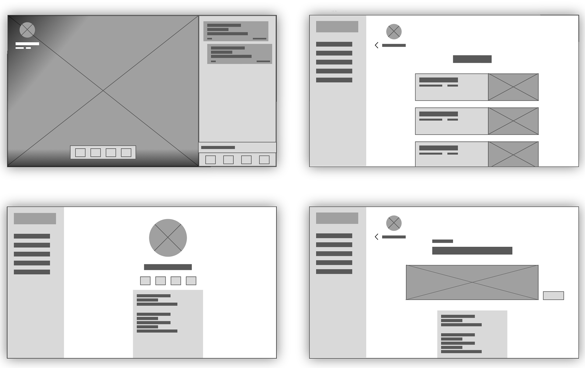
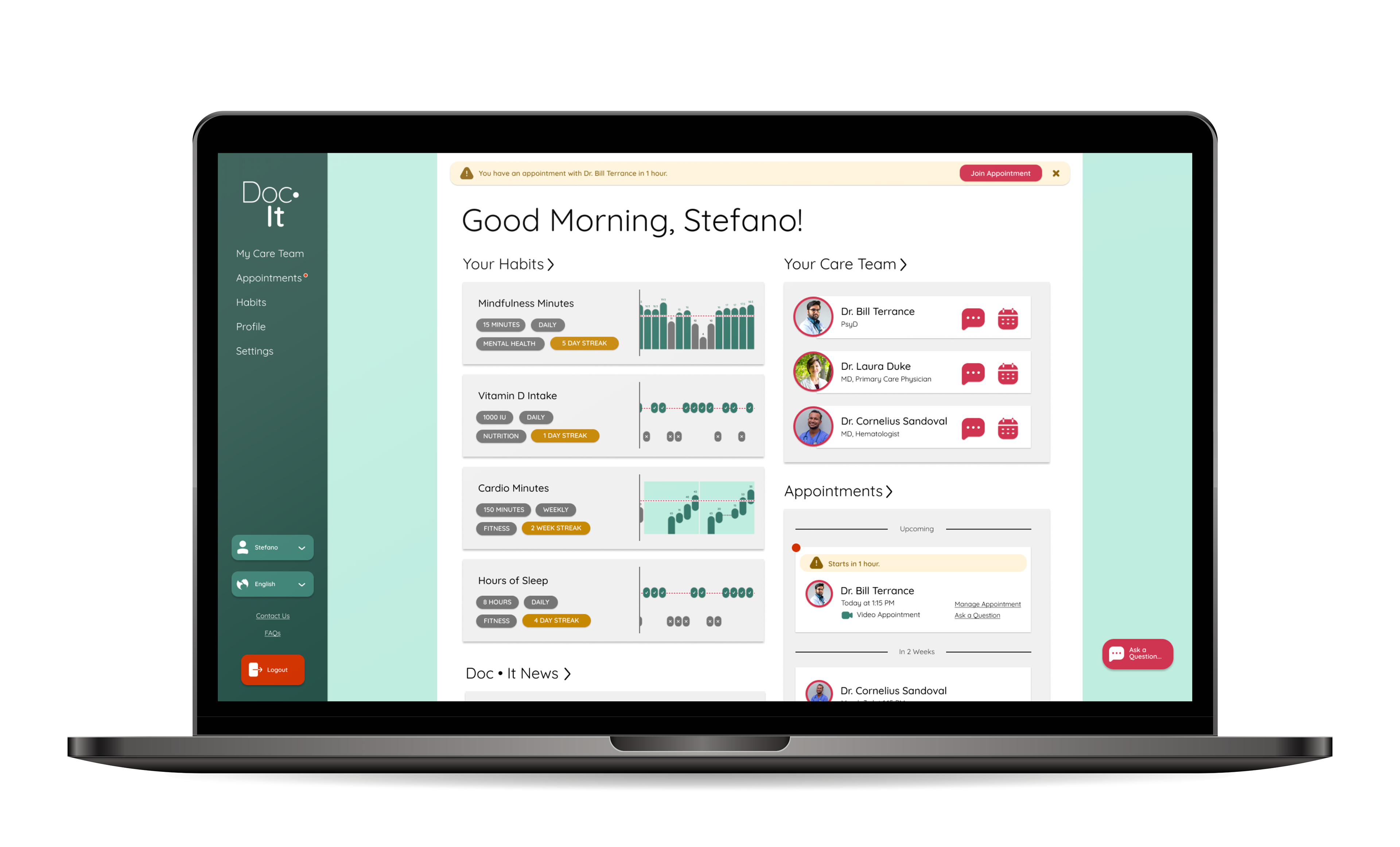
Doc•It began as a simple wireframe supplied by a UX Design member. It was my responsibility to bring it to life with visuals, icons, and colors.
These visuals would be selected with the interest in communicating vitality, organicity and stability. As such, I would incorporate rounded edges and soft drop shadows to suggest a gently skeuomorphic UI constructed of cards of soft paper.
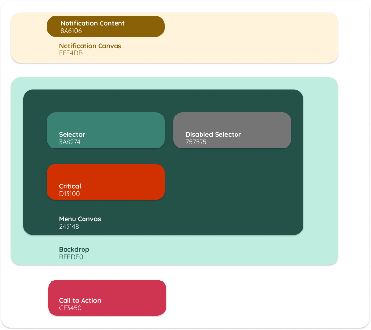
I selected staid shades of green to be the bedrock of the visual design, with magenta serving to accent calls to action, and red being reserved for critical actions and information such as logout controls and notification badges. Fill and font colors were selected to be compliant with WCAG AA contrast standards.
The key typeface I selected to appear throughout Doc•It is Quicksand, which I selected for its beautiful and harmonious balance of organic and structural ideals.

Putting It Together
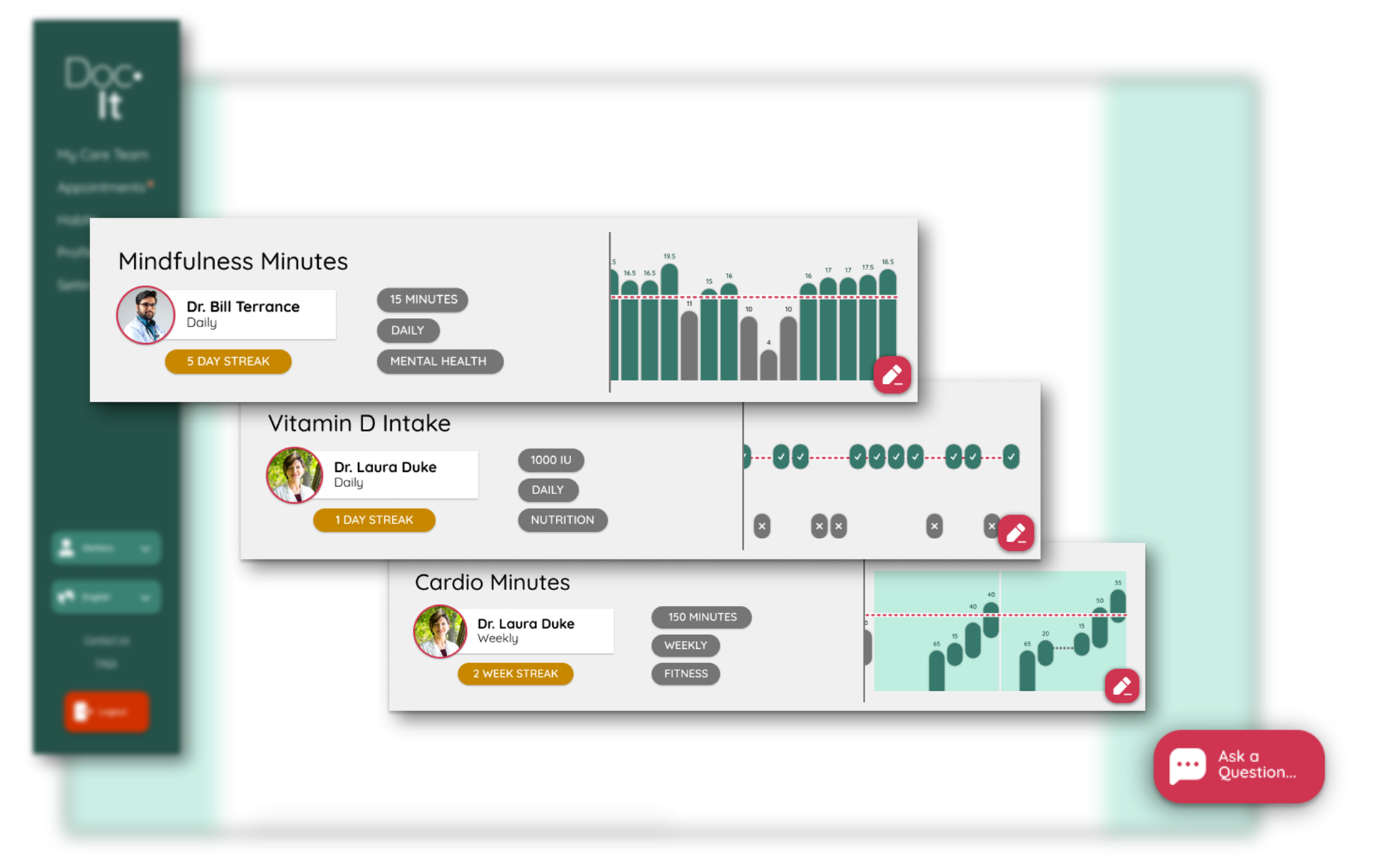
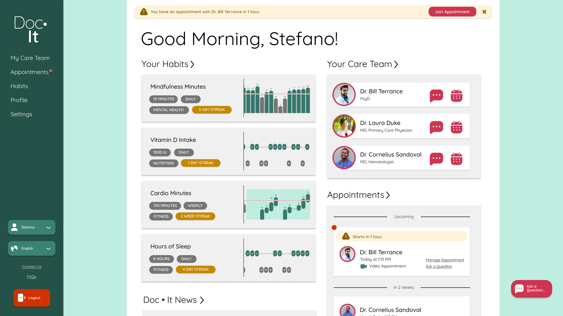
The Habits
Doc•It's key feature to build patient-doctor trust and understanding is its 'Habits' feature, which allows patients to upload daily progress on a range of health activities agreed upon from their doctor - from fitness, nutrition, to sleep hygiene, and more. A key responsibility of my visual design for Doc•It was presenting this data clearly and accessibly.
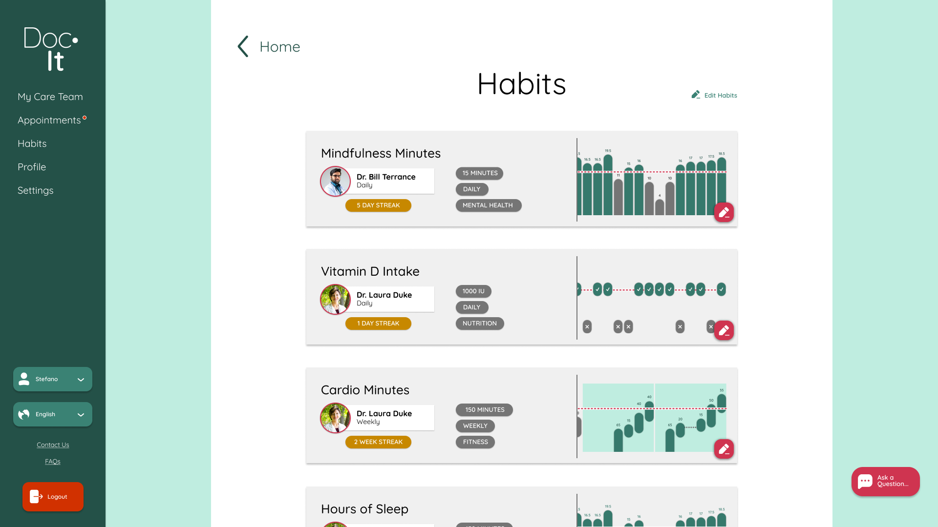
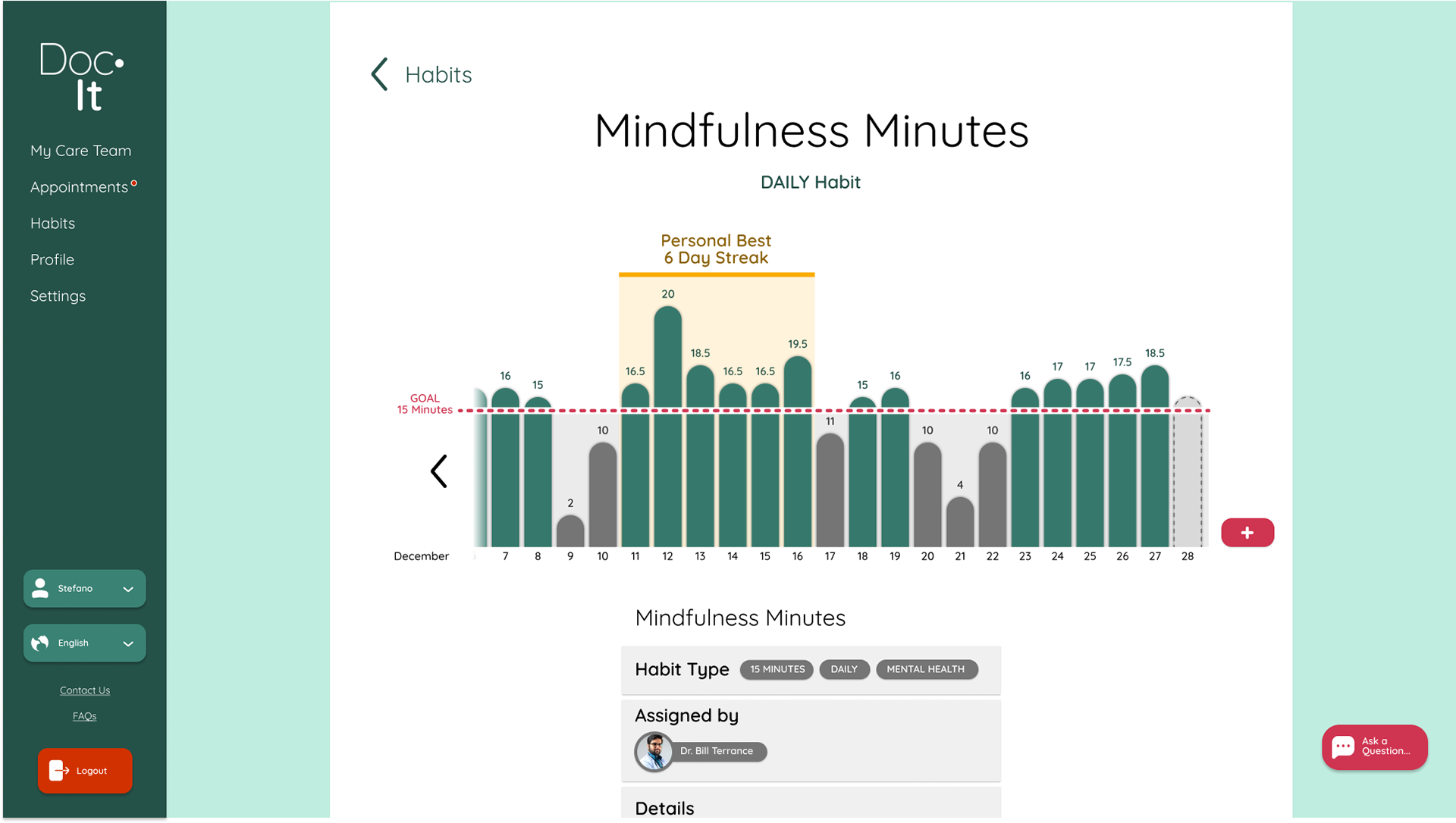
Accessibility First
Great care was placed into designing Doc•It's data visualization features with accessibility and legibility front and center. While color was used to accentuate data that meets or does not meet a goal, all graphs were designed in accordance with WCAG AA standards. Thusly, negative space is used between data columns and at the goal watermark so that users of any ability can read their data with ease.
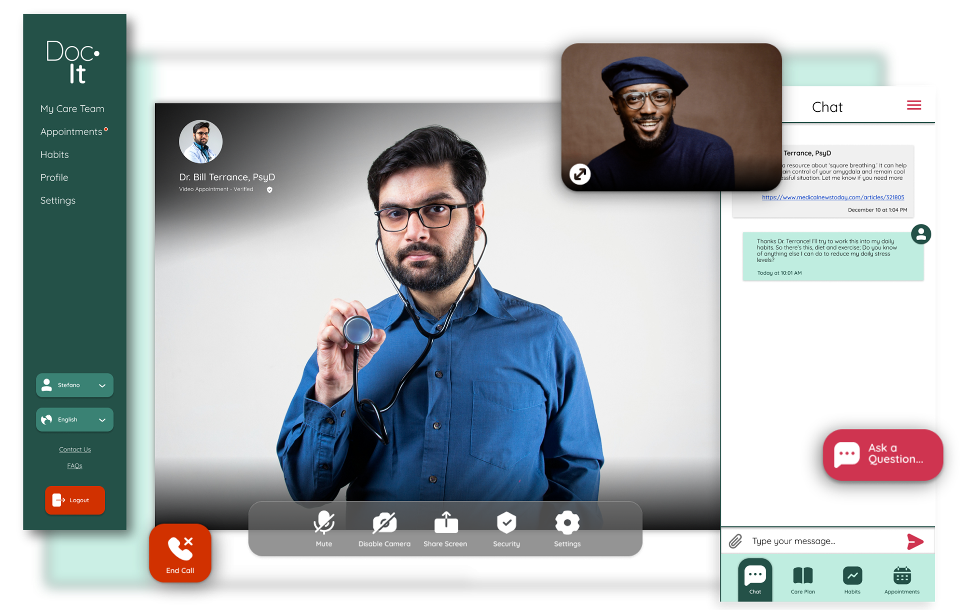
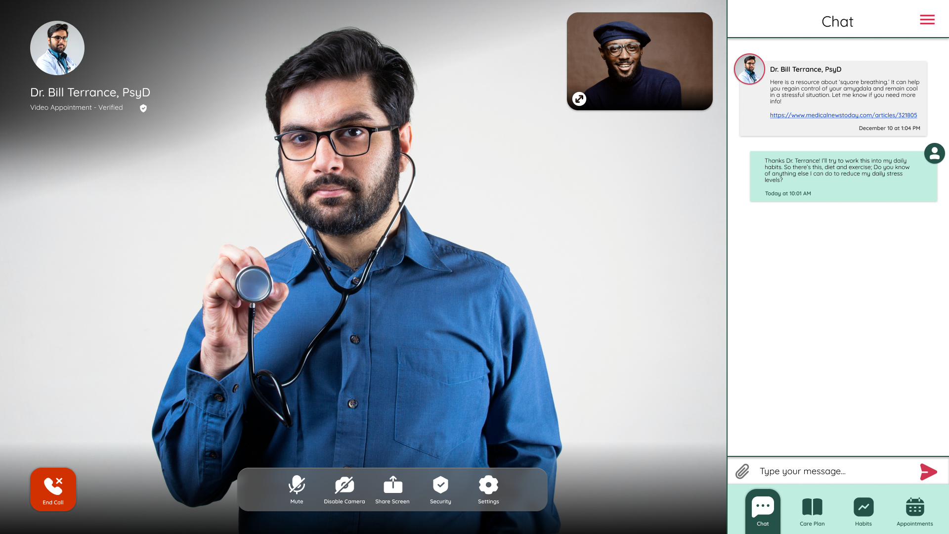
The Call
The core of the patient-doctor dialogue in Doc•It is its robust messaging systems. Secure video calling is supported by text messaging and file exchange so that both parties can keep accurate records and refer to past conversations. Key to this are the simple, soft visuals that stay out of the way but are always within reach. The Magenta-coded call to action is reserved only for the send button and menu button on the messaging pane.
Bringing it Home
Scalability Forward
Although Doc•It is designed as a desktop-first experience, the card layout makes the interface highly adaptable for other use cases such as mobile and even VR/AR. Additional features can easily be integrated into the home screen by adding cards.
Challenges Met
Doc•It gave me an opportunity to focus on designing beautiful, comforting visuals for a UX design that would help patients and doctors better understand and communicate with each other. Forging better patient-doctor relationships is key to improving health outcomes and patient satisfaction. With this visual design study, I used my design sense to create an environment to foster this understanding and help patients feel more at ease that they're receiving the exact care their body needs.