PROJECT: SeeFood ROLE: Visuals, Interaction, Research
DATE: December 2022 – February 2023 (3 months)
Project Vision
SeeFood is a snack ordering app for people for whom going to the movies is more than entertainment – it's an experience, a social event, and a point of connection. To that end, for this project, I decided to use a goal-oriented design method which revolves around focusing on understanding my personas and goals. To showcase my mobile visual design skillset, SeeFood exists as a mobile-first product.
Challenges
1 Design an intuitive interface for new and returning users
2 Enable a single user to coordinate group ordering
3 Provide a linear and easy purchasing flow
Conception
Initial research found that users don’t consider the movie theater a proper group activity as it isolates people for several hours. The goal was to create a product that elevates the movie-going experience to a true social outing with dinner, snacks and drinks. I began the project with this goal-oriented approach, and started with competitive analysis and persona construction.
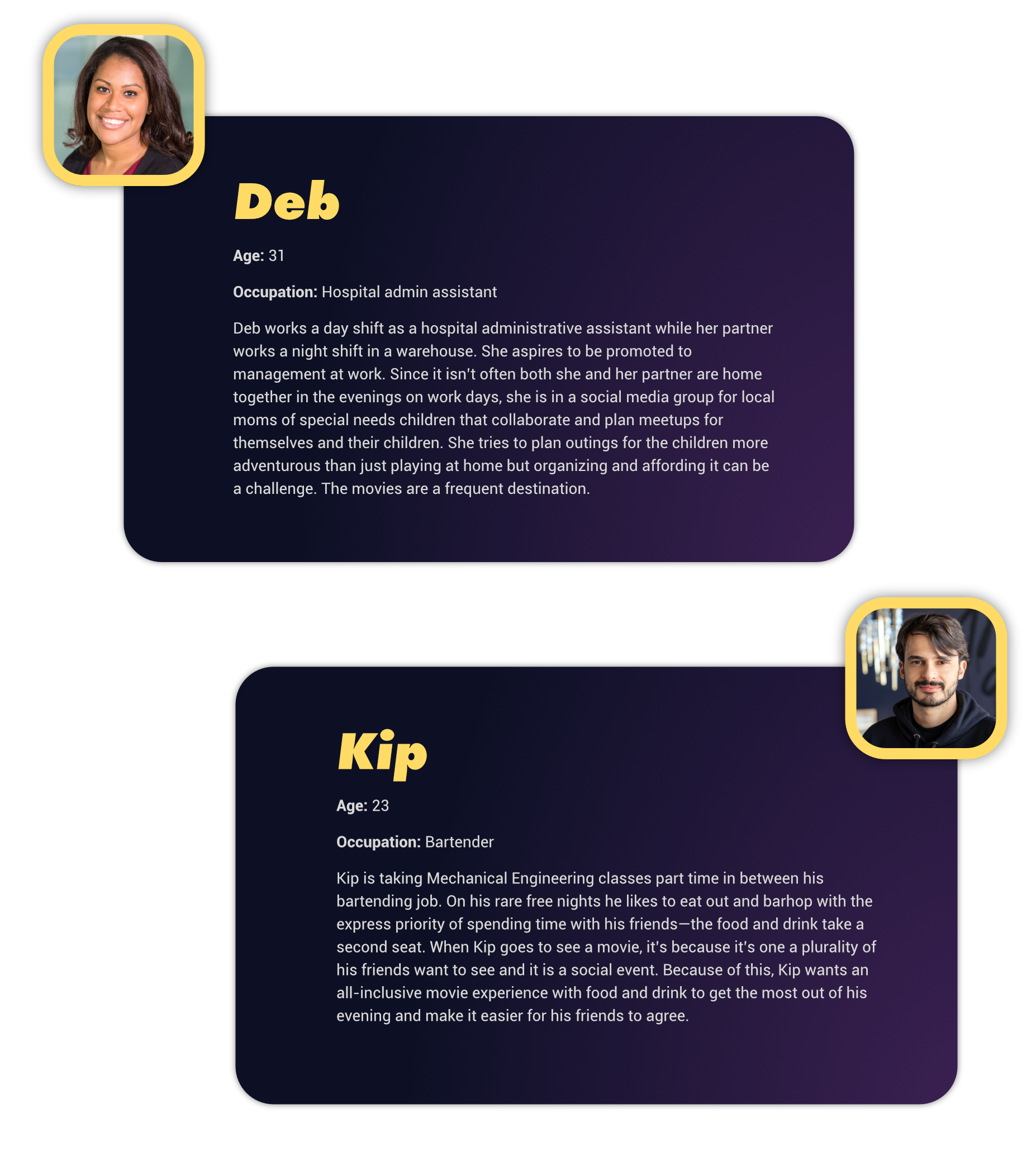
Meet the Personas
Competitive Analysis
I researched the food ordering experience of several directly competing movie theaters, as well as the experience of buying snacks from several indirectly competing retailers brought up by participants in initial research. Although some have strong offerings, these competitors fell short in group coordination for people in large friend groups or with groups of children.
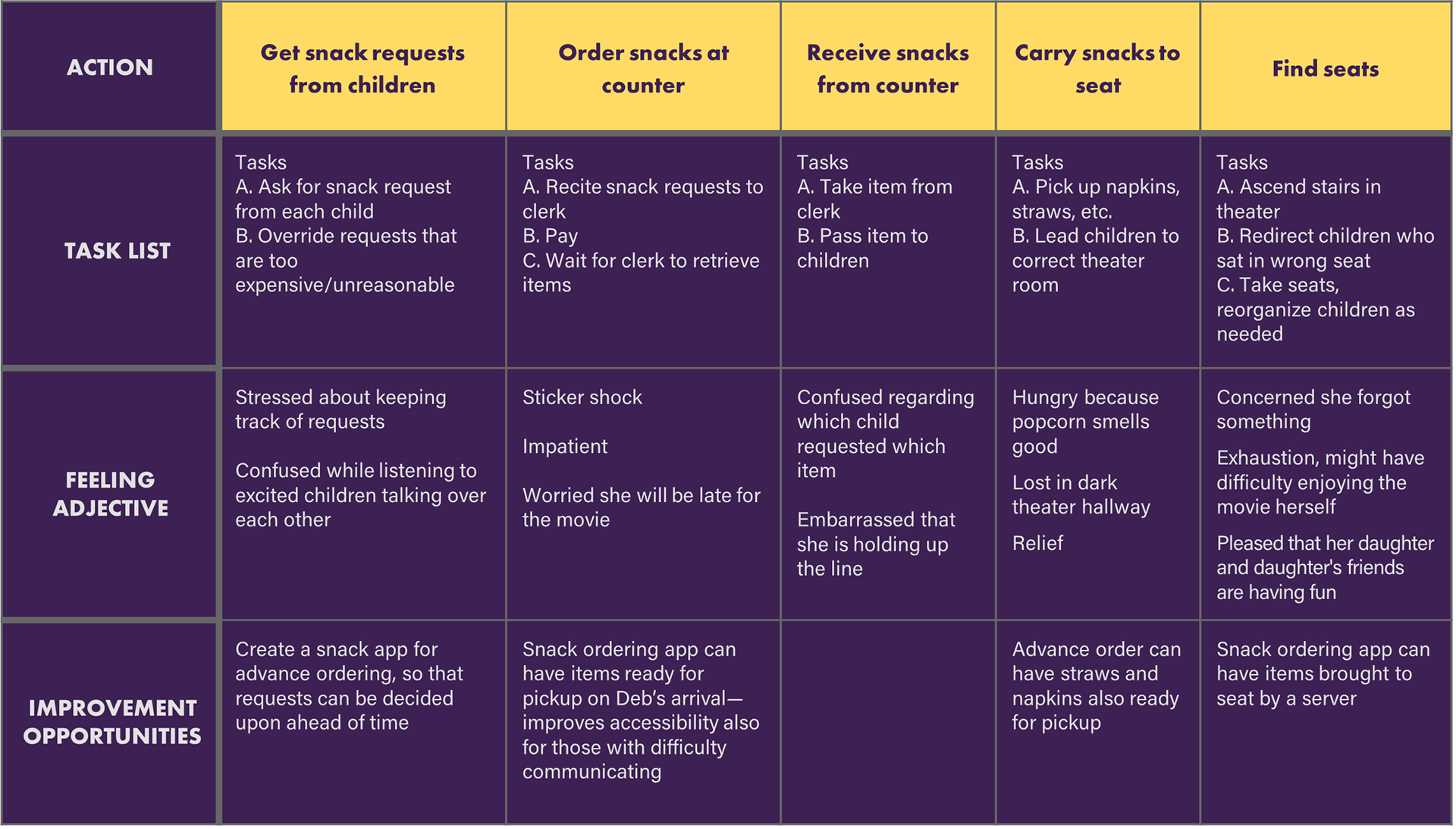
Mapping the User Journey
The user journey map for Deb simulated the inconvenient tasks she has to accomplish to order snacks for her daughters’ friend group while highlighting pain points SeeFood could alleviate.
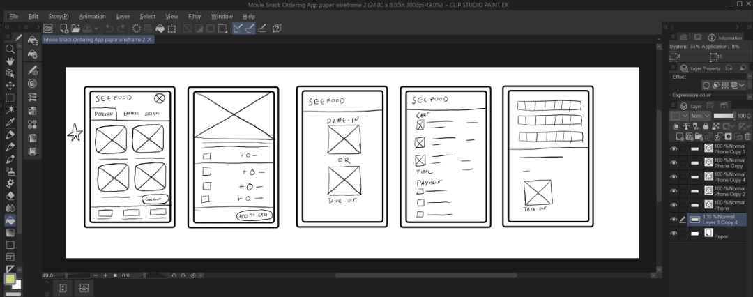
Wireframes
Digital wireframes put the menu front-and-center with a clear checkout call-to-action. Special care was taken to clarify the seat selection screen so that users can order for different seats.
Iteration 1
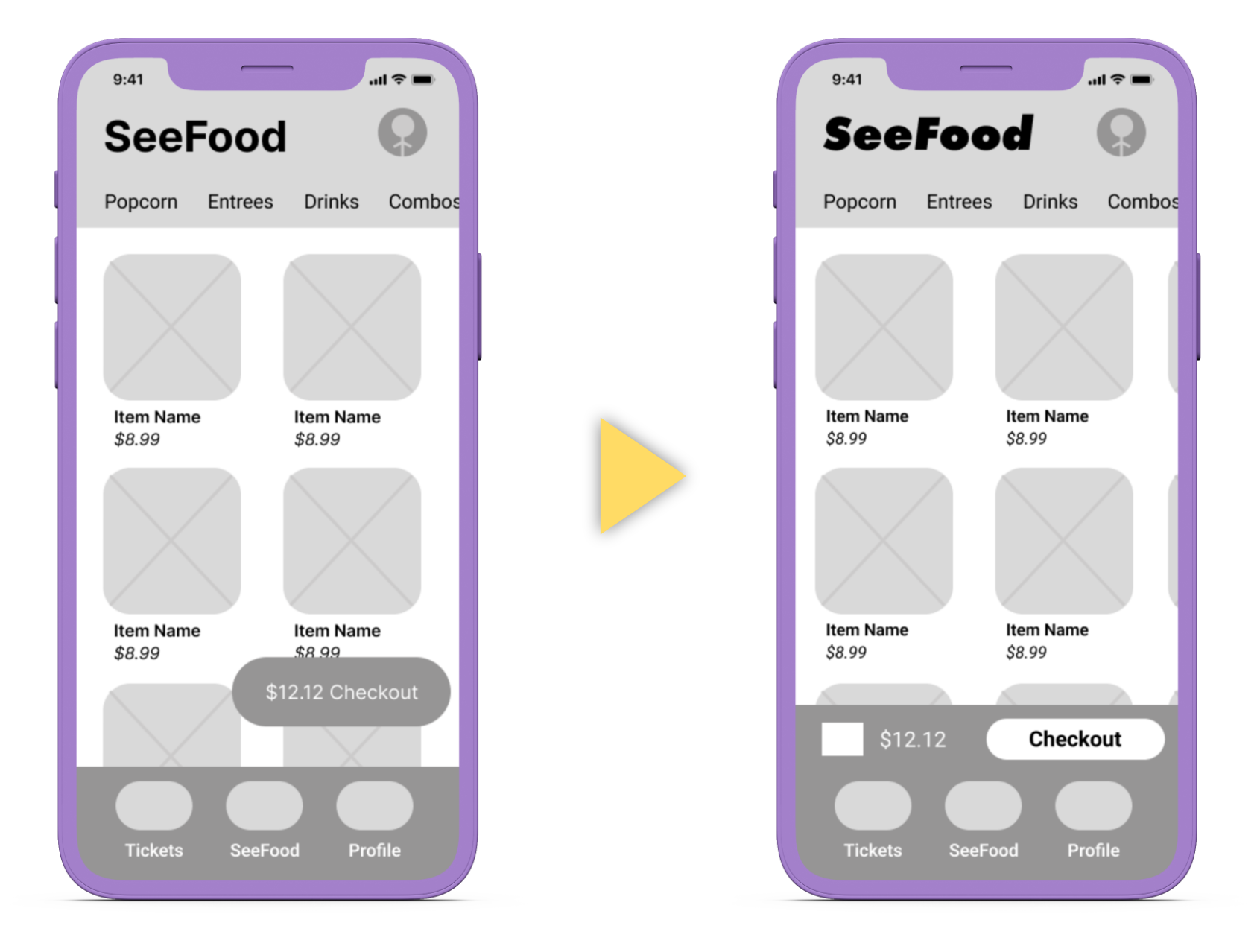
Initial usability testing revealed that the checkout call-to-action ‘pill’ was difficult to find when hovering over the menu, and may hamper visibility in a dark theater. I moved it to an isolated bar. Testing also revealed that reaching the top category ribbon was difficult for one handed users, so I added the ability to swipe the menu categories side to side.
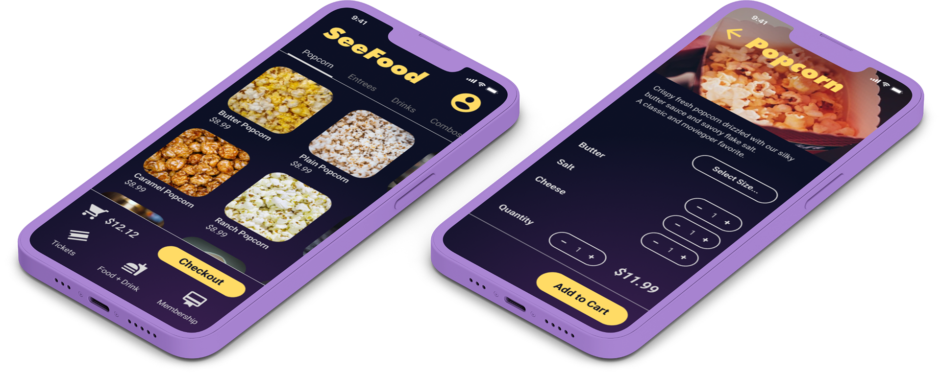
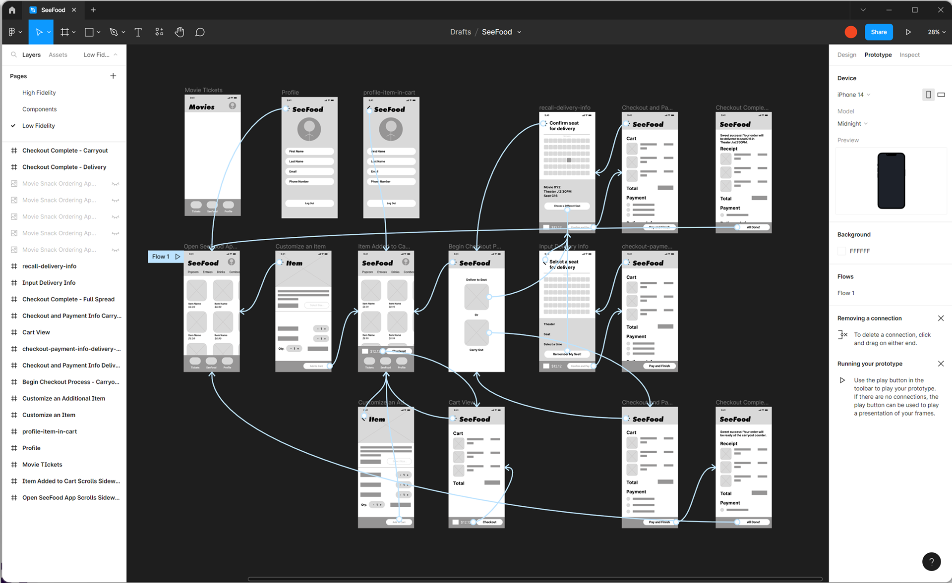
High-Fidelity Prototype
The app has been designed with a modern, high-contrast color palette that helps to emphasize the vivid pictures of the snacks. The color scheme is consistent throughout the app, providing a cohesive and visually pleasing experience.
Iteration 2
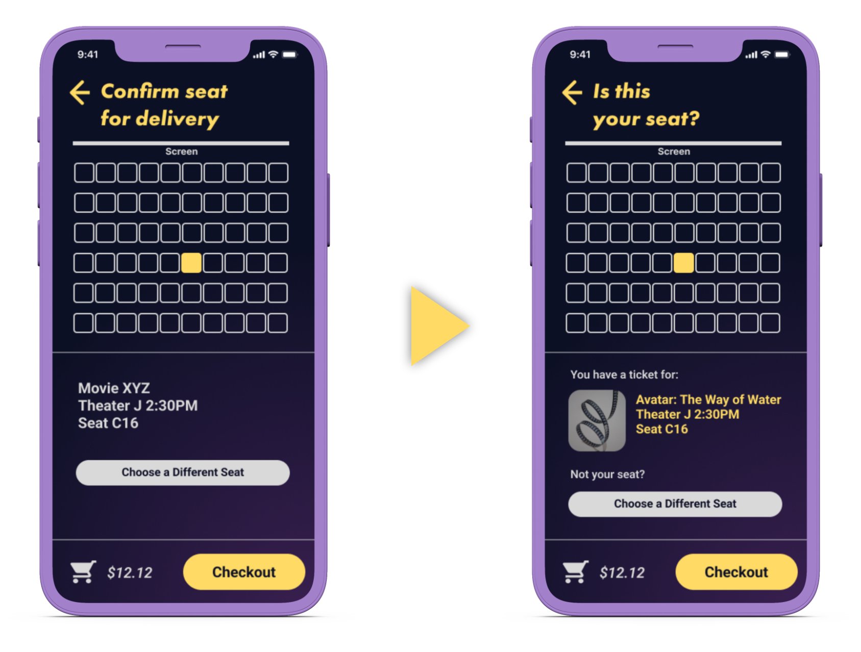
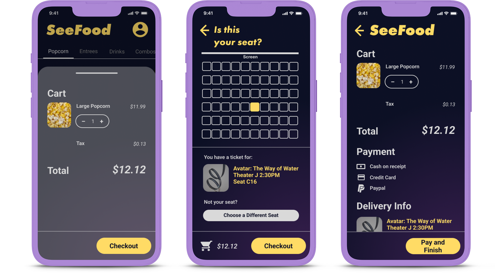
As I conducted further usability studies, I discovered that users were unsure if the automatically selected seat correctly reflected their ticket. I made the seat selection screen more conversational to reassure them, and added a thumbnail for their ticket. Users can still order for a different seat in the theater by tapping 'Choose a Different Seat.'
Finalizing the Prototype
Users are able to add items to their cart by simply tapping on the snack item they want to order, and can easily navigate between the various screens in the app using the clear and intuitive navigation menu, as well as through gesture-based navigation. For instance, users can swipe left or right to move between snack categories, or swipe up or down to scroll through the list of available snacks. The app also allows users to select the delivery method, choosing between delivery to their seat or takeout. For delivery orders, users can choose to order delivery to their own seat, or to another, if they are ordering for a friend or for someone who is unable to order for themselves.
The call to action for progressing through the checkout flow is always located in the lower right-hand corner of the screen in a vivid, contrasting color, ensuring that it is always easily accessible and reducing the need for excessive scrolling or searching.
Try the SeeFood High-Fidelity Prototype
Challenges Met
The design process for SeeFood enabled opportunities to meet and overcome challenges faced by users wanting to go to the movies as a group.
1 Design an intuitive interface for new and returning users
Gesture-based navigation makes it intuitive for new and returning users to explore the menu
2 Enable a single user to coordinate group ordering
Give users the ability to order for friends or others who may not be able to order for themselves
3 Provide a linear and easy purchasing flow
Call to action buttons enable users to traverse the entire purchasing flow with one hand
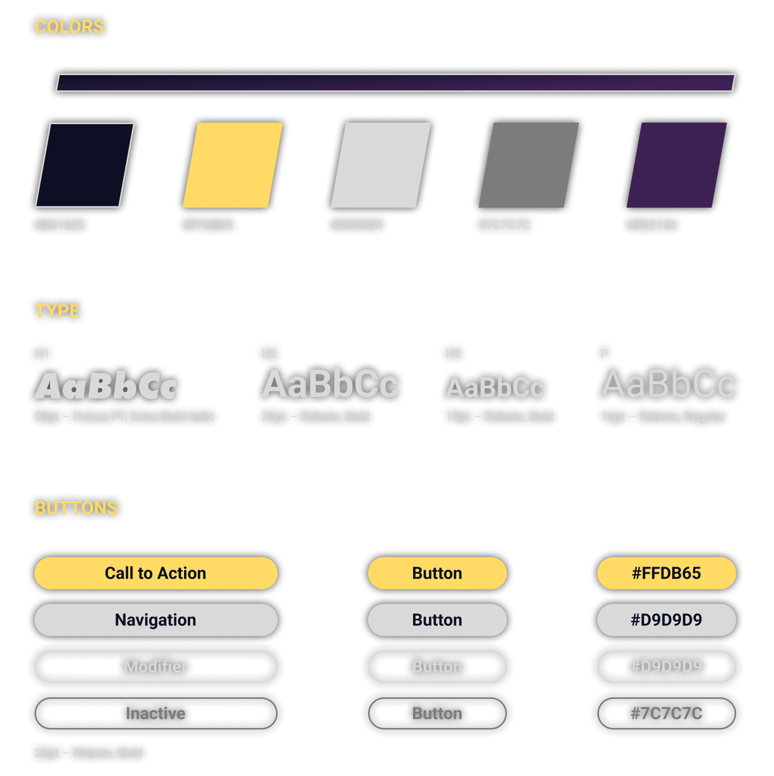
Style Guide
SeeFood's dark color scheme was chosen with the user's eye comfort in a dark theater in mind. The sparse use of popcorn-inspired gold on the call-to-action buttons guide interactions through the checkout flow, and the subtle gradient in the background creates a halo effect around the call-to-action buttons.
Takeaways
With the return to movie theaters after several years of avoidance, and a renewed knowledge of the importance of connection with friends, the moviegoing experience has more opportunity to reshape itself into a social event than ever. Part of this reshaping is the emphasis on food and drink, and how those things, as with entertainment, are best enjoyed together. It is my hope that my skills and methods in designing SeeFood product concept has illuminated how going to the movies might be a more rewarding experience for our friend and families in the future.
During this project, I learned the basis of empathetic design – realizing that how others experience a movie night may be very different than myself, and how this can effect how they interact with software products in surprising ways. Taking the time to interview others and see their thought process was an illuminating experience that I will take with me into future projects of all mediums.